Expert Tips to Help Improve Website Conversion Rate
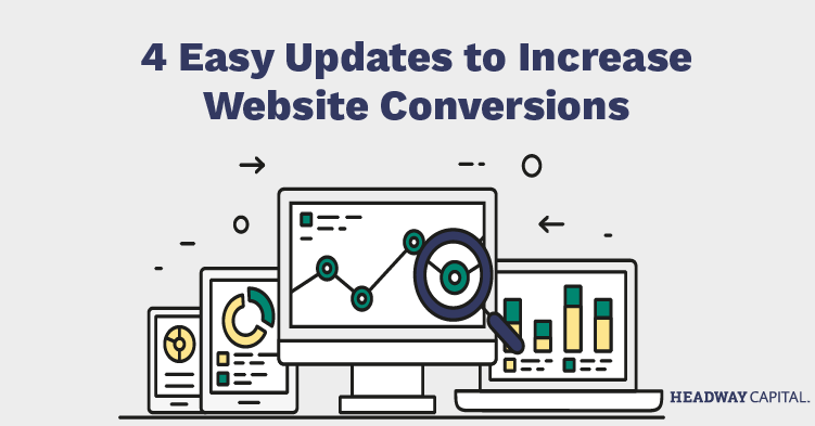
With winter approaching, what’s your plan for the slow season? According to a recent survey, roughly 25% of small business owners intend to upgrade their company website by the end of year.1
Transitioning to the digital world can be daunting, particularly if you don’t already sell online or aren’t tech-savvy. Luckily, a few minor improvements can go a long way.
We spoke with Nicolette, Senior UX Designer at Enova (NYSE: ENVA), for four simple updates to help increase conversions and how to implement them on your website.
1. Make a Convincing Call-to-Action (CTA)
What does your website offer? Ideally, would you like visitors to make a purchase, schedule an appointment, download a file or do something else entirely? From online ads and social posts to banners, buttons and sidebars, a compelling and well-designed CTA helps direct customers through your website and leads them to conversion.
UX Expert’s Recommendations for a Strong Website CTA
- Think of a CTA as a link or button(s) that leads customers to those conversions. A CTA should feature action-packed language that creates a sense of urgency for a user and make them want to click. Steer clear from vague statements and use actionable words that relate more directly to your product or service, like “Get a free sample” or “Start my application”.
- Any designer will agree one of the most important design decisions for your website is the color and placement of your CTA button(s). Generally, a CTA button should be in a prominent page location and use a contrasting color against all other content on your website. Play around with a variety of colors and even shapes before taking a few strides back from your screen to ensure it’s still prominent from a distance, as that will be the true test.
2. Make it Easy to Convert
A seamless, easy-to-use website can help increase conversions as well as improve the overall user experience. From the layout and payment options to product images and details, how simple is it to find and access the website resources that are needed to convert? We’ll let the expert UX designer share a few ideas.
Top Factors To Increase Conversion Convenience for Your Customers
- One-click purchasing: Expedite the digital shopping experience with a faster method of checking out online.
- Most popular items: Highlight your top items to help feature the best sellers for visitors that are new to your store or short on time.
- Accept a variety of payment methods: Go beyond the major credit cards. Utilize secure cloud payment services like PayPal, Venmo and CashApp to expand your options.
- Subscriptions: Monthly or semi-annual subscription agreements take the hassle out of shopping for everyday items.
- Free/reduced shipping: A free shipping threshold can help entice visitors to meet order minimums.
- Feature-rich content: Use high-quality content on product pages, like a demo video, item specifications and detailed photos.
3. Make Your Content Relevant
What do your customers want? What do they expect and need from your brand? Website content should complement your company and appeal to customers the same way a storefront helps entice visitors inside. Consider all the information a visitor would want from your brand, from the About Us and FAQ Page to information pertinent to your products and services.
Key Ways To Keep Your Small Business Website Relevant
- Add related content and keep it updated! Content generation should be an ongoing process to help keep your website up-to-date and active so that search engines can find and link your site. Setting aside a once-a-month task to add a short blog to your site will make a world of difference in showing your customers that you’re the expert in your field. Staying updated with the latest trends and topics will keep you ahead of your competitors, and provides content to share across your social media platforms, as well.
4. Fine-Tune Your Website
According to a recent survey, a one-second webpage load delay results in approximately 7% loss in conversion. Similarly, a website that’s not easily found on search engine result pages (SERPs) won’t help you reach new customers. While there are many back-end ways to upgrade a website, we’ll focus on two of the fastest to improve your site and make it easier to find.
What’s an Easy Way To Make a Website Faster?
- Optimize your photos! It’s so easy to upload photographs to a website, but because it’s so easy and quick, users often forget to optimize content for web. Without this step, content starts to add up on your backend, slowing down general site speed. Learn more about your options to help improve website page speed.
What Can Entrepreneurs Do To Boost Website Visibility?
- Search Engine Optimization, or SEO, helps improve website traffic by matching the words people use on search engines to relevant content/pages on your site. Think about the key phrases and “keywords” that users are typing in to find your website, and then integrate those words into your pages as often as possible. Take it a step further and figure out all the other ways those phrases could be searched using synonyms to reach your site. Once you have these phrases down, take a look at Google’s autocomplete results by typing in a query without hitting the ‘Search’ button just to see additional terms that other people have used. Read this SEO guide for more information.
- Do you have a physical location? If so, ensure that your business details like website, phone number, business hours and address not only have the same information, but are all formatted the same way across all major listings (Google Local Listing, Yelp, Facebook, etc.). Synchronized information helps your off-page SEO.
References
1Bredin. (2020). SMB yearend priorities.


